 Aaargh... This just ain't fair!
Saturday, May 23, 2009
A motherload of Prē screenshots released to tease us of webOS goodness
 Aaargh... This just ain't fair!
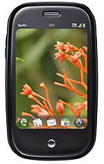
With the official release date of Palm Prē™ is just around the corner on the early month of June, we are being teased so many times with numerous Palm Prē™ hands-on in the wild by those 'generous' yet morally cruel beta testers, who consciously take pictures and worst is leaked out the video of the Palm Prē™ test handsets in action.
Oh, the torture never ends! When will I can get one for myself...
And if that wasn't enough, here comes another one. Palm Goon (via Engadget Mobile) has released a motherload of Palm Prē™ screenshots which have never been seen before. This confirms some of the Prē™ features, and better yet reveals three new features: auto-backup, auto-update & First Use utility.
Like any of you, I quickly rushed to the Palm Goon but just to found out that the website's server is heavily populated and busy so I couldn't get the pages rendered perfectly. Thank goodness it's weekend, otherwise I wouldn't had the time to keep pressing the refresh button. So after tiresome attempts to see them all, I took the liberty to re-post the screenshots here so my fellow addicts can also enjoy them. Excited? Well, so am I. Let's dig 'em! (Note: click on the images to enlarge them)
Looks like Palm has created the Prē™ to stay updated and backed-up automatically, so you won't be bothered doing all of those routine but technically important actions. Of course you can turn on/off the backup feature, or even do a manual backup. There's a "First Use" utility to help you set up your Prē™ for the first time, and create or link up to a Palm online profile. Other little thing I love about the Prē™ is those large menu buttons, they're looking very finger-friendly, so who says we still need a stylus these days? The Prē™ will challenge the iPhone in terms of finger-friendly touchscreen, that's for sure.
One of the important features in smartphone is its ability to create a list of tasks and to-dos for your hectic schedule, easy to make and easy to manage, those are the keys for the Prē™ to win the hearts of busy multitaskers (the cue goes to business men/women & housewives ;-p). It doesn't look like going to take a rocket scientist to use the task and to-dos list in the Prē™, in fact judging from what Palm Goon demonstrated with the above screenshots, seems like it's so enjoyable and easy to use.
The Prē™ comes with "copy & paste" feature in almost every utilities and apps in it, so is including in here. iPhone, you better watch out.... And in case you're wondering what is that circled "i" button on the next of each tasks made in the list, clicking on it will open up notes for the given task as you can see on the second screenshot from the right. Still on the particular screenshot, you can also see there's a small "envelope" icon on the right corner below the screen, that's just how the Prē™ will notify you when there's a new email. Neat, eh?
This "Memos" feature in the Prē™ is just as useful and intuitive as the “Tasks” but simply serves a different purpose, said Palm Goon. The "Memos" home screen is simply eye-catchy, as pictured on the most left screenshot above, and looks as good when viewed with the Prē™ cards system (far right screenshot). Clicking on the "New Memo" sticky pad icon at the "Memos" board will open up a new sticky pad memo with random color, to change the color of the new memo is simply by tapping on the slightly folded memo on the right corner at the bottom screen, and then choose from the four colors available. And not to be forgotten; you can also "copy & paste" in here. Another "uh-oh" for iPhone... ~LOL~
The Prē™ web browser looks to take the battle head-to-head with iPhone's Safari web browser, a true worthy contender for Apple to worry. Palm Goon noted that the Prē™ web browser is "truly fast, intuitive, full-featured web browsing, and what you get is the full HTML version of the page. No mobile watered down version. You get all of it. Lightning fast and incredibly accurate to form."
The Prē™ web browser home screen shows you an input bar on the top, and the bookmarks are hanging out as thumbnails in the background as you type. Another feat for our eyes is how the Prē™ can handle multiple web pages opened up at once and displayed them all together on the cards system, as pictured at the most right screenshot above. This really shows the Prē™ raw power to do real multi-tasking, something Apple tries so hard to avoid in iPhone. A very big double "uh-oh" for iPhone... ;-p
Head on to each of Palm Goon's links to see all of the screenshots in their full size, just get ready to drool for more of the webOS™ goodness. Remember, you've been warned... And just in case you didn't notice, Palm Goon also throws a Palm Prē™ giveaway contest so be sure to check it out.
If the Palm Prē™ is really going to be as good as advertized, then I can't wait for Palm to release a slew of webOS™ devices in near future. Because based on what I've seen so far, including from these Palm Goon's screenshots, I'm quite sure Palm has a real ace in its palm. Let's just hope Palm does make the webOS™ versatile enough to power up various kind of devices for the next years to come.
Subscribe to:
Post Comments (Atom)

No comments:
Post a Comment